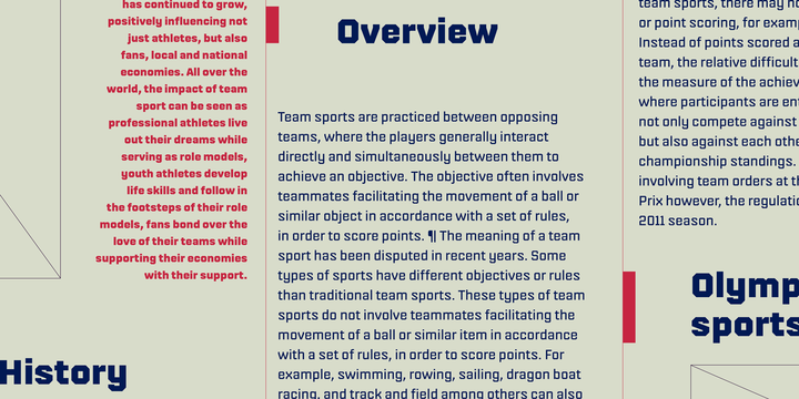
Fielder is a sans with an instantly-recognisable source of inspiration from the world of athletics. That’s right: this is a display typeface designed for sports jerseys! All the letterforms’ curves have been straightened out into horizontal and vertical lines, held together by some diagonal elements. While most letters from Fiedler have been drawn in a monolinear way, there are a few cases where strokes have been thinned down, to prevent the overall letterform from getting too dark. Have a look at the crossbars on the ‘a’ and ‘e’, for instance. Fielder includes several nice alternates. For instance, one Stylistic Set will replace the standard ‘G’ with a version that has an added beard, but no crossbar. Another includes an ‘L’ whose right-hand side curves up a bit. A third Stylistic Set has alternate forms for ‘M’ and ‘N’, while the fourth includes an alternate ‘R’, the fifth a ‘T’ with curled arms, and the sixth has a closed-topped ‘4’.

